



The safest LinkedIn post image size is 1200 x 1200 pixels (square, 1:1), with 1200 x 628 pixels (landscape, 1.91:1) as the alternative for wide graphics and 720 x 900 pixels (4:5) for vertical images on mobile. Those are the sizes LinkedIn itself recommends for images in the feed, and they're what we'd use for event graphics too.
Most size guides stop at the numbers. That's fine until you design a speaker graphic, someone posts it from their phone, and the speaker's face gets cropped by the "see more" fold. So below you'll find the official specs, what each format is good for, and how to set up event graphics (speaker, attendee, sponsor, exhibitor) so they look right wherever they're posted.
What LinkedIn's own specs say about image dimensions
LinkedIn publishes exact image dimensions for single image posts in its official single image specs. They're written for sponsored content, but sponsored posts appear in the same feed as organic ones, so they're the most reliable official reference you'll find for both.
- Landscape (1.91:1): 1200 x 628 px recommended, 640 x 360 px minimum, shown on desktop and mobile.
- Square (1:1): 1200 x 1200 px recommended, 360 x 360 px minimum, shown on desktop and mobile.
- Vertical 4:5: 720 x 900 px recommended, shown on mobile only.
- Vertical 2:3 and 1:1.91: 600 x 900 px and 628 x 1200 px, also mobile only, with a 360 x 640 px minimum for all vertical images.
The file rules are the same for all of them. JPG, PNG or GIF, up to 5 MB. LinkedIn also notes that very tall 1:1.91 images get borders on either side, and it recommends 4:5 if you want to avoid them.
Which LinkedIn post image size should you pick?
Square, for most event content. A 1200 x 1200 image displays on desktop and mobile, takes up a good amount of the feed on a phone, and gives you room for a face, a name and an event name without squeezing anything. Landscape is better for wide visuals like a venue panorama or an agenda overview, while 4:5 vertical takes up even more of the mobile screen but only gets the vertical treatment on mobile.
If you're unsure, design square. It's the format that's hardest to get wrong.
One more thing on resolution. A LinkedIn post image size of 1200 x 1200 is the recommendation, but LinkedIn accepts up to 4320 x 4320 for square images, so designing larger and exporting down is fine as long as the file stays under 5 MB. Going below the minimum is where you get into trouble, because LinkedIn has to scale a small image up and fine text turns soft.
LinkedIn image dimensions for event graphics
Event graphics have a specific problem: the most important thing on them is a person's face and name, and that's exactly what gets lost if the crop is off. This is how the LinkedIn image dimensions above map to the typical graphics around an event.
Say you run a 400-person fintech summit with 30 speakers, 12 sponsors and 40 exhibitors. That's several graphic types, each with a different job in the feed, which is why one size for all of them rarely works.
Speaker graphics
Speaker announcements work best as square posts. Put the photo in the upper half, the name and title right below it, and the session title plus date at the bottom, with the event logo in a corner. Keep the speaker's name big enough to read on a phone without zooming (a name in tiny type on a busy background is an easy way for these graphics to fail). Our speaker announcement template guide goes through layouts in more detail.
Attendee "Meet me at" graphics
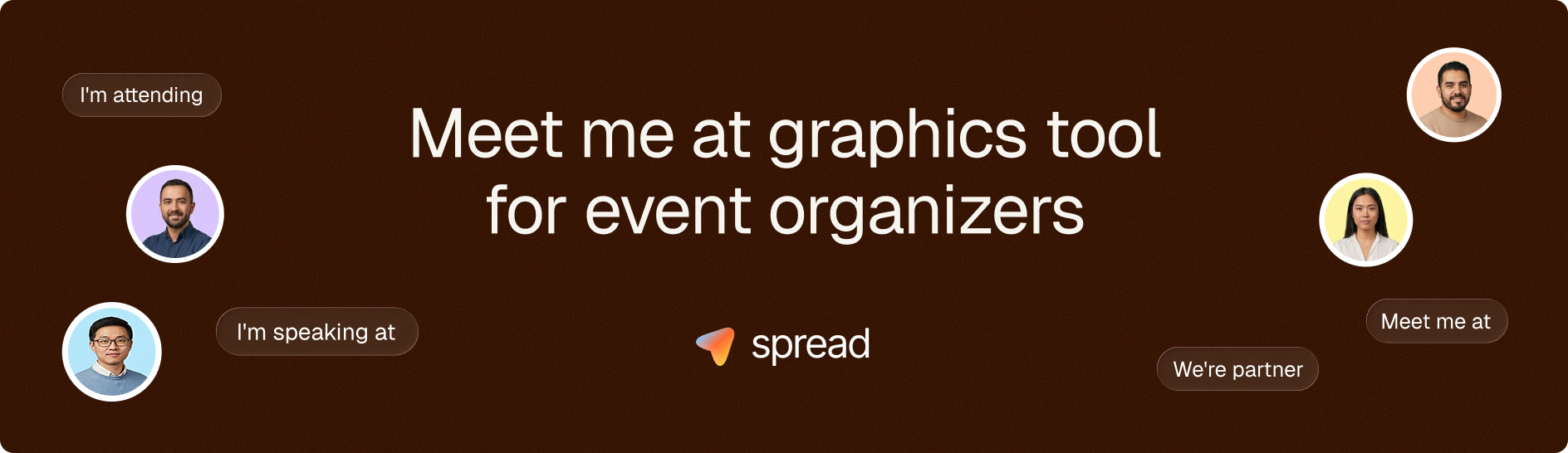
For attendee posts, square or landscape both work. The graphic should carry the attendee's photo, a line like "Meet me at" or "I'm attending," the event name, date and city. Leave space around the photo area so that photos with different crops (a tight headshot, a wider shot) still look fine. If you're collecting ideas, our Meet Me At graphics guide has examples.
Sponsor and exhibitor graphics
Partner and Visit Us graphics need room for two brands, yours and theirs. Landscape gives you that space, because you can place the event branding on one side and the partner logo plus booth number on the other. For exhibitors, the booth number is the single most useful piece of information on the graphic, so give it real size. If a sponsor insists on square, stack the logos vertically instead of side by side.
What about LinkedIn story size and vertical formats?
For vertical images in the LinkedIn feed, LinkedIn's specs recommend 4:5 at 720 x 900 pixels, and that's the size we'd use if you want a tall post on LinkedIn. A full-screen 9:16 graphic (for example a 1080 x 1920 canvas) is the format people use for Instagram stories and WhatsApp status, and it's useful because attendees rarely post on just one platform.
So when someone searches for a LinkedIn story size, the practical answer for an event is to prepare two things: a feed image for LinkedIn (square, landscape or 4:5) and a 9:16 version for stories elsewhere. Go Spread exports the same personalized graphic as a LinkedIn post, a 9:16 story and a landscape version, so attendees can pick the one that fits wherever they're posting.
LinkedIn carousel size and document posts
Carousels on LinkedIn come in two flavors. Carousel ads have their own spec page, separate from single images. For organic posts, most people make a "carousel" by uploading a PDF as a document post, which LinkedIn displays as swipeable pages.
For document carousels, the rule that matters most is consistency. Make every page the same size, because mixed sizes look messy as you swipe. Square pages (for example 1080 x 1080) or 4:5 pages work well on mobile, where most swiping happens. For events, a short carousel is a good format for an agenda preview or a speaker lineup, with one speaker per page. Keep the first page as strong as a single image post, since it's the only one most people see before deciding whether to swipe.
Design rules that matter more than exact pixels
Getting the LinkedIn post image size right avoids the worst problems. These rules decide whether people actually read the graphic:
- Text that's legible on a phone screen at arm's length, which usually means fewer words in bigger type.
- A safe margin of roughly 5 to 10% around the edges, so nothing important sits where a crop or a rounded corner can cut it off.
- One focal point, ideally a face, because a graphic with a person on it reads as a personal post.
- Your brand colors and logo, but in a supporting role (the attendee is the star of their own post).
- A PNG export for graphics with text and logos, since JPG compression can blur small type.
Animated graphics are another option. LinkedIn accepts GIFs within the same 5 MB limit, and a subtle animated background catches the eye in a static feed. Go Spread supports animated backgrounds that export as GIF, which is handy if you want speaker or attendee graphics to stand out without making them busy.
How to check a graphic before it goes out
Post it to a test account or send it to yourself, then look at it on a phone. That five-minute check catches most problems: a cut-off name, a logo that's too small, text that disappears against a background photo. It's much cheaper than a speaker politely telling you their graphic got cropped. Check it in dark mode as well, because a logo with a transparent background can vanish against a dark interface.
Getting every attendee the right LinkedIn image dimensions
The hard part at events is that you aren't posting the graphic. Hundreds of attendees, speakers and sponsors are, from different devices, often in a hurry. If you send them a PNG and ask them to add their own photo in a design tool, some of the results will be stretched, cropped or simply never posted.
That's why we built Go Spread around one link. You upload your design (SVG or PNG, with a transparent or full graphic detected automatically) or start from one of 17 templates, and each person adds their photo on a campaign page at go-spread.com/your-campaign. They get their graphic in the right format and can post it to LinkedIn with a suggested caption in about 30 seconds. Across our first 20 campaigns, that averaged about 100 posts per event. For more on the creator side, see our guide to the LinkedIn graphic creator, and if you also need the event page header, our LinkedIn event banner size guide covers that format.
Use the right LinkedIn post image size on your next event graphic
For your next event, design the main graphic at the square LinkedIn post image size of 1200 x 1200 pixels, keep the face and name inside a safe margin, and test it on a phone before anyone posts it. Then add a landscape and a 9:16 version for sponsors and stories. If you'd rather not build three versions by hand, set up a free campaign on Go Spread and let attendees create their own correctly sized graphic from one link.